Ma (Negative Space) in Japanese Composition
Ma—the Japanese word for space or interval—is fundamental to Japanese aesthetic philosophy. It refers to the intentional empty space in a composition, which is considered as important as the occupied space. In sushi plating, ma means not filling every inch of the plate. A plate with five pieces of nigiri distributed with intentional spacing looks more sophisticated and refined than the same pieces crowded together. The empty space creates visual breath and suggests restraint and control. A plate that appears too full looks amateurish; a plate that's thoughtfully composed with deliberate negative space looks professional and intentional. This principle challenges Western impulses to fill available space. In Western plating, more is often considered better (more food, more components). In Japanese aesthetics, less is more. The viewer's eye is drawn through the composition by the relationship between occupied and empty space.
Odd Numbers and Asymmetrical Balance
Arrangement in odd numbers (three, five, seven) creates visual interest that even numbers don't. An even arrangement (two, four, six) feels balanced and static. Odd numbers inherently create asymmetry, which reads as more dynamic and natural. Beyond number, asymmetrical placement creates more sophisticated composition than symmetrical placement. A plate divided visually in half (symmetric) is static. A plate where elements are placed off-center, with varying distances and angles, reads as more intentional and composed. This asymmetry should feel balanced and considered, not random or chaotic. The eye should sense intentionality and flow, not accident. Achieving this balance requires awareness and practice. Over time, a chef develops intuition about placement that feels right.
Height, Depth, and Dimensionality
Professional plating incorporates three dimensions, not just the plate's flat surface. Height variation—pieces standing at different levels—creates visual interest. A piece of nigiri might stand upright (highest point), another might recline at an angle, a third might rest flat. This variation creates shadow and dimensionality that photographs capture well. Depth is created by layering: perhaps a sauce on the plate, then a piece positioned in front, then a garnish behind, then a sauce drizzle in the far corner. This layering, viewed from above, creates visual interest. The composition invites the viewer's eye to travel through the plate, not rest on it all at once. This dimensionality is what separates plating that reads as flat and boring from plating that reads as dynamic and composed.
Moritsuke Styles: Five Traditional Arrangements
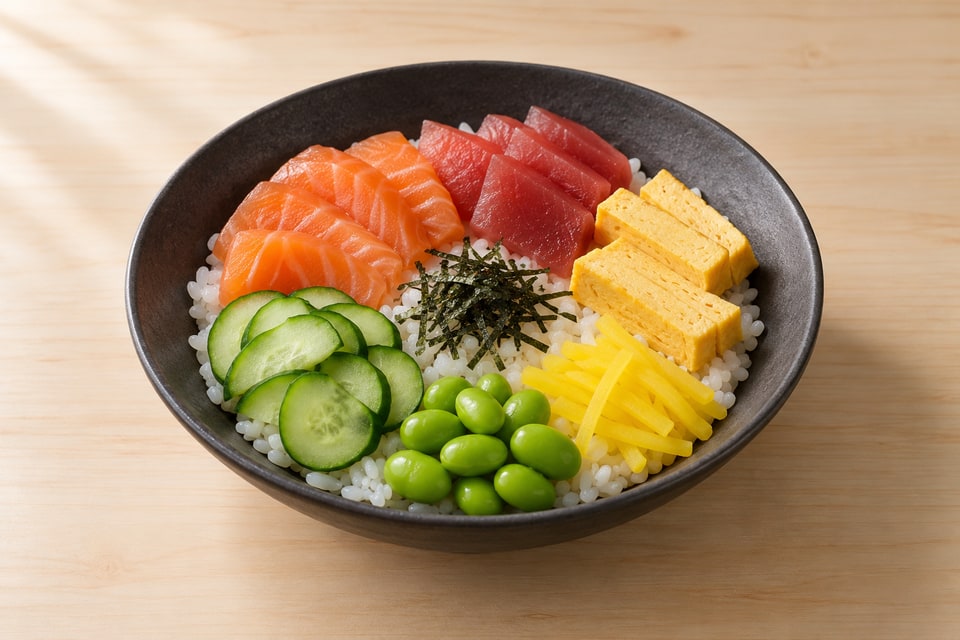
Japanese cuisine defines five traditional plating styles. Sugimori arranges food in the shape of a small hill or mound, resembling a sugi (cedar tree). Kasanemori creates layers or a pyramidal stack. Nagashimori arranges food in a line, suggesting flow or movement. Yosemori groups items in clusters with space between groups. Chirashimori scatters items randomly across the plate. Each style creates a different visual effect and is appropriate for different situations. Understanding these traditional frameworks is useful as starting points; a modern chef often blends elements across styles or creates new approaches while respecting the underlying principles. These names and definitions appear in traditional Japanese cuisine texts and training programs, though modern sushi often blends them rather than adhering rigidly.
Plate Selection Philosophy and Color
Plate material, shape, and color profoundly affect how food appears. White ceramic plates create maximum contrast with colorful ingredients; black plates create dramatic contrast with lighter foods; natural wood suggests warmth and tradition. The shape—round, rectangular, square, irregular—suggests different aesthetics. A round plate feels classical and balanced. A rectangular plate feels modern and graphic. An irregular or sculptural plate feels contemporary and innovative. The plate's size relative to the food suggests abundance or restraint. A small plate with modest food suggests scarcity or minimalism. A large plate with food spread sparsely suggests sophistication. A large plate with abundant food suggests generosity. Understanding these communications allows a chef to choose plates intentionally rather than arbitrarily. Many high-end sushi establishments commission custom plates from artists, turning the plate itself into part of the artistic statement.
Color Contrast and Seasonal Visual Coherence
Color creates emotional and visual impact. Warm colors (red, orange, yellow) feel energetic and welcoming. Cool colors (blue, green, purple) feel calm and sophisticated. The contrast between warm and cool creates visual interest. A plate of purely white fish against a white plate might appear pale and boring; adding a warm-colored garnish or sauce makes the composition more visually engaging. Seasonal coherence means the colors suggest the season: spring greens feel fresh and young; autumn golds and reds feel rich and mature; winter whites and silvers feel austere and refined. A chef who understands color psychology can build visual and emotional coherence across multiple dishes. A sequence of dishes that builds in warmth and saturation throughout the meal creates a visual and emotional arc that parallels the taste arc.
Keep these details in mind.
- Ma (negative space) is as important as occupied space; thoughtful spacing creates sophistication
- Arrange in odd numbers with asymmetrical balance; even numbers and symmetry feel static and predictable
- Create dimensionality through height variation and layered depth; avoid flat, one-dimensional compositions
- Know traditional moritsuke styles (sugimori, kasanemori, nagashimori, yosemori, chirashimori) as starting frameworks
- Choose plates intentionally considering material, color, shape, and size as part of the total aesthetic communication
From reading to cooking.
Chirashi Bowl · Perfect Sushi Rice
Return to the journal ↗